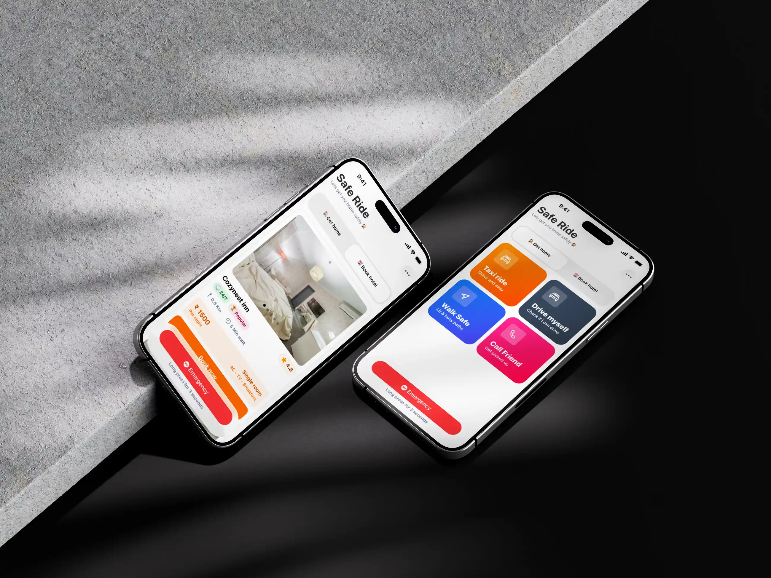
SafeRide
Redesigned a healthcare provider's patient portal to reduce appointment scheduling friction and improve medication management for 2.3M active users.
2 Months
UI/UX Designer
SafeRide is a mobile app designed for people who need reliable cab rides late at night, particularly targeting women, solo travelers, and young professionals commuting after dark. The app launched with strong early interest but was struggling to convert first-time users into repeat riders. Retention after the first ride sat at just 31%, and the booking drop-off rate during late-night hours was nearly 58%. The core challenge was clear: people were opening the app when they needed it most, but something in the experience was stopping them from following through. The project goal was to identify what was breaking trust and redesign the experience to make night rides feel genuinely safe, fast, and dependable.

The existing app had a standard ride-booking flow that felt no different from any generic cab app. There was no visible safety infrastructure during the booking process, no contextual reassurance for users booking alone at 1am, and no real-time communication features that addressed the specific anxieties of riding at night. Driver profiles showed only a name and star rating. The SOS button was buried three taps deep inside the menu. The ride-sharing feature existed but was hidden entirely. For users in a dark parking lot trying to get home safely, the experience offered nothing that spoke to their actual emotional state in that moment.

To understand the real problem, sixteen user interviews were conducted, split evenly between women and men aged 19 to 36 who regularly used cab apps during nighttime hours. The interviews uncovered a consistent emotional arc: users felt a spike of anxiety the moment they opened the app after dark, which only grew during the waiting period and peaked when a stranger's car pulled up. Most users said they texted a friend the driver's details manually because the app gave them no easy way to share trip information. Several had experienced rides where the driver deviated slightly from the route and had no way to flag it without feeling like they were overreacting. Trust was not just low, it was fragile.
The deepest lesson from this project was that safety in a product is not a feature, it is a feeling. Users did not need the app to eliminate every possible risk. They needed the app to acknowledge that the risk existed and show, through every small design decision, that it was being taken seriously. The most meaningful changes were not the new screens but the things that were moved closer, the SOS button, the driver's real details, the guardian share option, and the route visibility. When the design stopped hiding its safety infrastructure in settings menus and started making it part of the natural experience, users stopped feeling alone in the dark and started feeling accompanied. That shift, from product to companion, was what the numbers ultimately reflected.