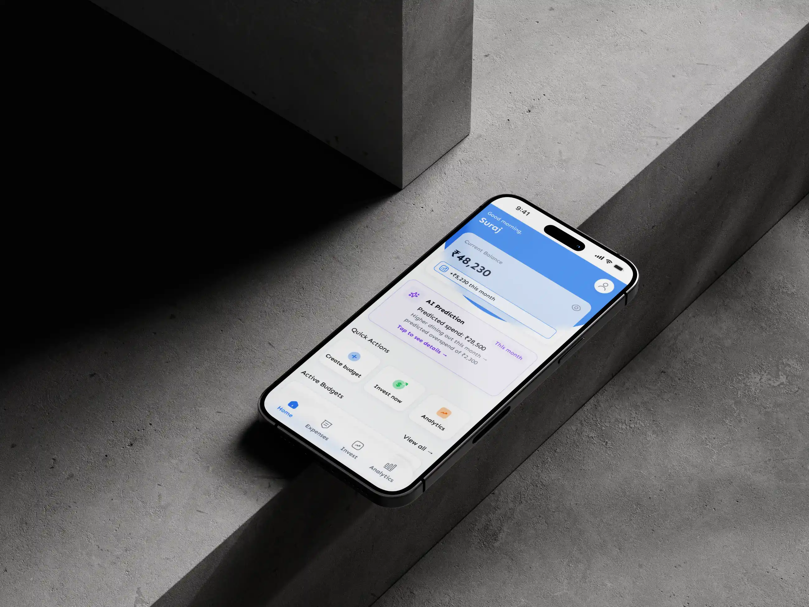
Finance Dashboard
Created an analytics dashboard for K-12 teachers to monitor student progress and identify learning gaps across multiple classes and subjects.
1 Month
UI/UX Designer
PayFlow is a fintech startup offering a mobile payments app for young professionals who want a fast way to send money, split bills, and manage daily spending. Despite having a solid product under the hood, the app was struggling with a 67% drop-off rate during onboarding. Users were abandoning the sign-up process before they ever got to experience what the app could actually do. The project goal was to diagnose why this was happening and redesign the experience from the ground up.

The existing onboarding flow had 11 screens, required manual document uploads for identity verification, and gave users no visual indication of how far along they were or how much longer the process would take. Error messages were vague, the language was full of financial jargon like "KYC," "IBAN," and "BIC codes," and there was nothing on any of the screens that communicated why the app was worth the effort of signing up. Users felt confused, anxious, and untrusted.

To understand the problem more deeply, twelve moderated user interviews were conducted with people between the ages of 22 and 34. The sessions revealed that users strongly associate visual polish with trustworthiness when it comes to financial apps. Most expected onboarding to take under three minutes, and nearly everyone wanted to understand why their personal data was being collected before they handed it over. Anxiety was highest at the document upload step, where users feared their submission would be rejected without explanation.
A competitive analysis of apps like Revolut, Wise, Cash App, and Monzo showed that shorter flows with clear progress indicators consistently outperformed longer ones. Hotjar analytics confirmed that 54% of PayFlow's users were leaving specifically at screen seven, the document upload screen, with heatmaps showing repeated taps on the back button before they finally quit. An affinity mapping exercise on Miro brought all these insights together under five core themes: trust, clarity, speed, feedback, and control.