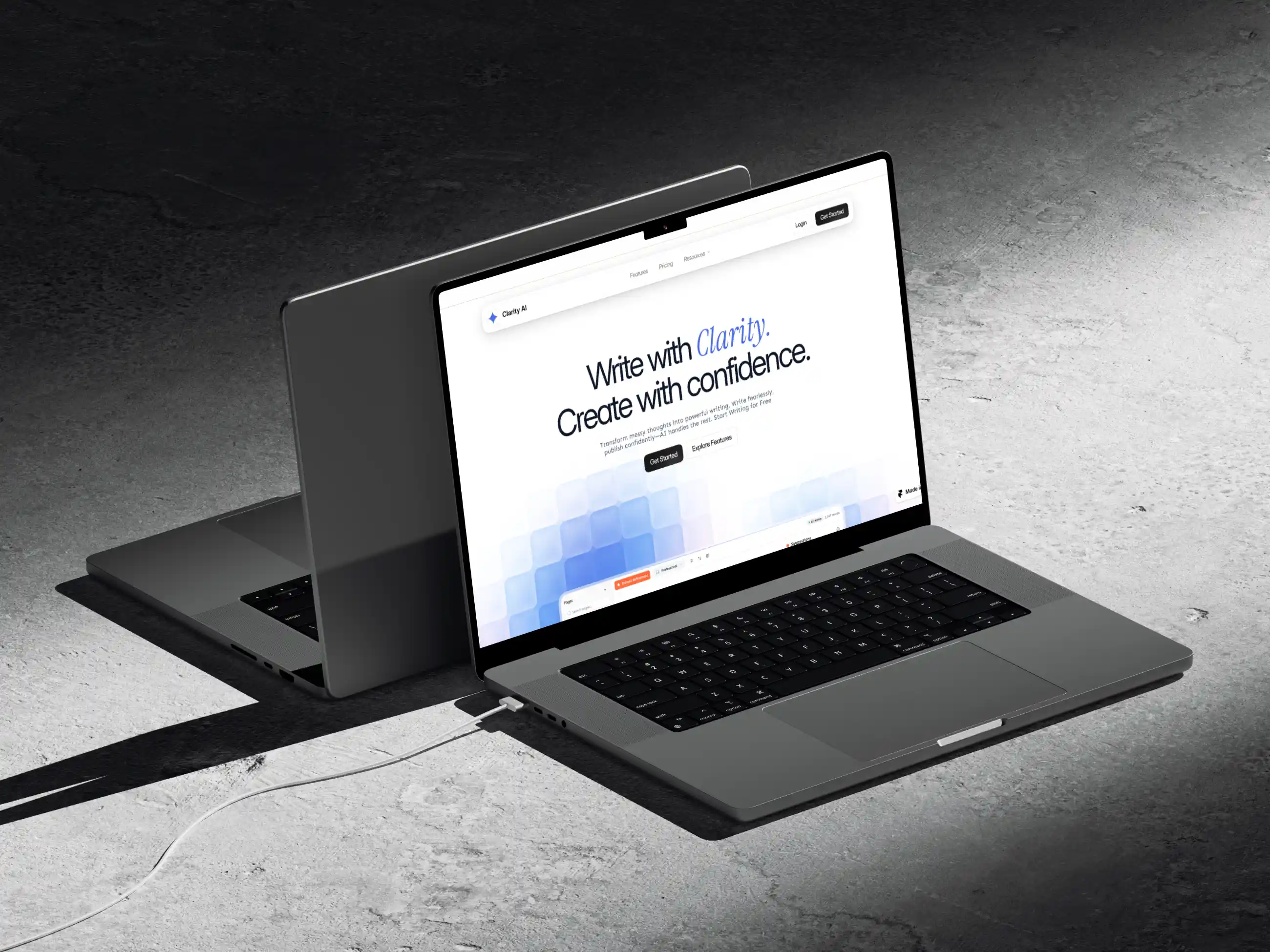
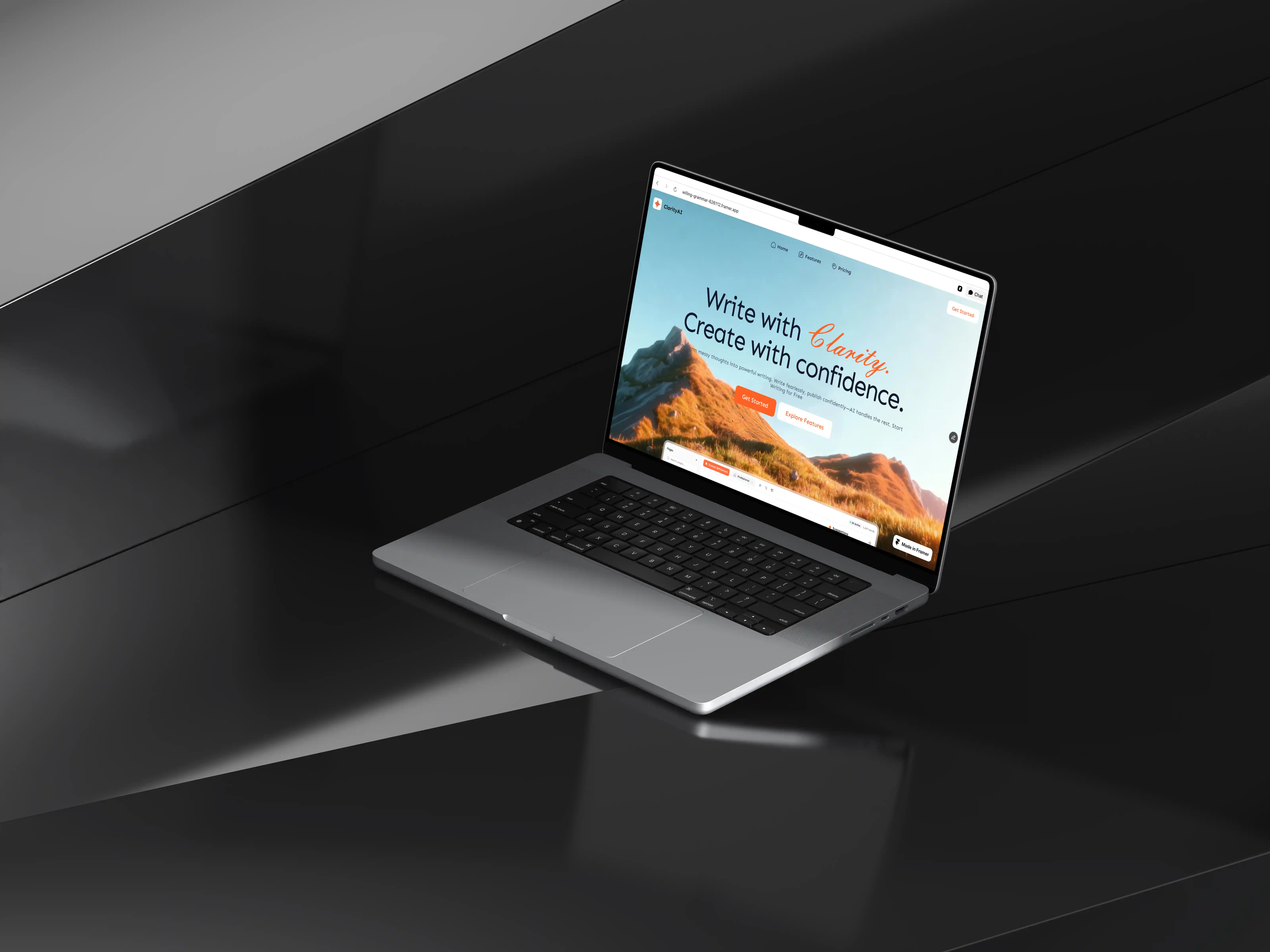
Clarity Writing Tool
An AI-powered writing tool for capturing, organizing, and retrieving notes with ease.
6 Months
UI/UX Designer
Clarity is an AI-powered writing and note-taking tool built for knowledge workers, students, and creative professionals who live inside their notes but consistently struggle to get value back out of them. The app launched with a clean interface and a strong early following among productivity enthusiasts, but engagement data told a complicated story. Users were capturing notes at a healthy rate but returning to them at a very low one.
The research phase involved nineteen user interviews conducted with people who had used Clarity for at least three weeks alongside a diary study where eight participants documented their note-taking behavior across ten days. The interviews revealed a deeply consistent pattern. Users arrived at Clarity with high intent, often migrating from other tools like Notion, Bear, or Apple Notes, motivated by the AI promise. Within the first week they would set up folders, create a structure they felt good about, and begin capturing actively. By week two, the structure had started to feel like a burden.
A new feature called Threads was introduced to replace the folder structure, grouping notes not by where the user had put them but by what the AI recognized they were about, updating dynamically as new notes were added and explicitly showing users the connections between ideas they had not consciously linked themselves. The home screen was redesigned away from a chronological list toward a daily brief that surfaced three to five notes the AI identified as currently relevant based on recent captures, calendar context pulled with permission, and recurring topics in the user's writing. A distraction-free writing mode called Flow was added that hid all navigation, showed only the current note and a soft ambient word count, and offered inline AI suggestions that could be accepted, dismissed, or expanded without breaking the writing state.

The lesson the project kept surfacing was that intelligence in a product is only valuable when it reduces the user's cognitive load rather than adding to it. Clarity had been intelligent in ways that required the user to interact with that intelligence explicitly, to assign tags, to choose folders, to construct precise searches. The redesign made the intelligence invisible at the right moments and present at the right ones, which is a much harder design problem than building the AI capability itself, and the one that ultimately determined whether users came back.